15 ways to do a book
- - - - - - - - - - - - - - - - - - - - - - - - - - - - - - - - - - - - - - - - - - - - - - - - - - - - - - - - - - - - - - - - - - - - - - - - - - - - - - - - - - - - - - - - - - - - - - - - - - - - - - - - - - - - - - -
day 1, 29.01.2007
etc publications host a workshop about making books with 15 students
at the art school in La Chaux-de-Fonds, Switzerland.
-----------------------------------------------------------------------------------------------------------------------------------------------------------------------------------------------------------------------------
| day 1 | day 2 | day 3 | day 4 | day 5 |
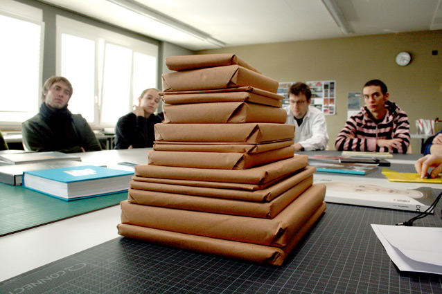
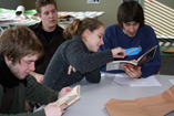
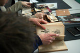
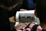
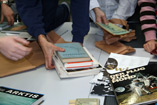
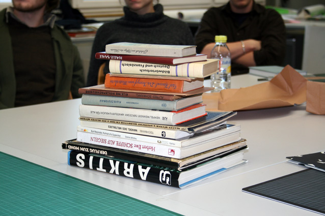
As an input and a point of reference for the whole workshop each participant received a vintage book, which is meant to be touched, read,
analysed, compared, questioned, torn apart and recomposed. Below the participants briefly introduce their books and give their first impression.

- - - - - - - - - - - - - - - - - - - - - - - - - - - - - - - - - - - - - - - - - - - - - - - - - - - - - - - - - - - - - - - - - - - - - - - - - - - - - - - - - - - - - - - - - - - - - - - - - - - - - - - - - - - - - - -
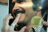
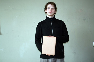
" On the cover he has spinach in his teeth. "
-----------------------------------------------------------------------------------------------------------------------------------------------------------------------------------------------------------------------------
Arnaud
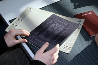
Title: Deutsche Bildhauer um 1900 (German Sculptors around 1900)
Year: 1925
Quality: hardcover, number of pages 48 + 8
I like... : All of it. There are some strange aspects for example with the eight extra pages somewhere in the middle of the book. The type is nice. And the paper.
I dislike... : The style of the picture sometimes is very ugly.
- - - - - - - - - - - - - - - - - - - - - - - - - - - - - - - - - - - - - - - - - - - - - - - - - - - - - - - - - - - - - - - - - - - - - - - - - - - - - - - - - - - - - - - - - - - - - - - - - - - - - - - - - - - - - - -
Caroline
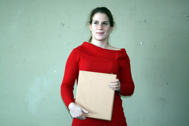
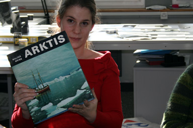
Title: Arktis
Year: 1975
Quality: hardcover, number of pages 188
I like... : The information graphics are nice and there enough pictures so that it is not getting boring. Below the dust jacket is a very nice cover.
I dislike... : The photos inside are not presented well. Their appearance is rather chaotic.
- - - - - - - - - - - - - - - - - - - - - - - - - - - - - - - - - - - - - - - - - - - - - - - - - - - - - - - - - - - - - - - - - - - - - - - - - - - - - - - - - - - - - - - - - - - - - - - - - - - - - - - - - - - - - - -
Christian
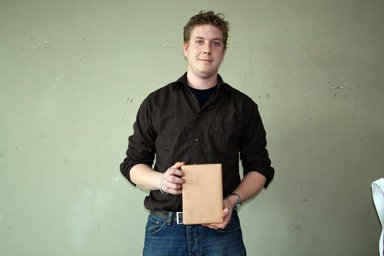
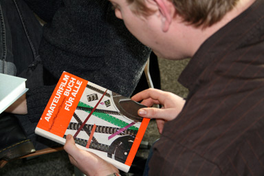
Title: Amateurfilmbuch für alle (Amateur Film Book for Anybody)
Year: 1981
Quality: hardcover, number of pages 384
I like... : I like the way the glossary is done.
I dislike... : I just like it.
- - - - - - - - - - - - - - - - - - - - - - - - - - - - - - - - - - - - - - - - - - - - - - - - - - - - - - - - - - - - - - - - - - - - - - - - - - - - - - - - - - - - - - - - - - - - - - - - - - - - - - - - - - - - - - -
Dimitri
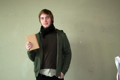
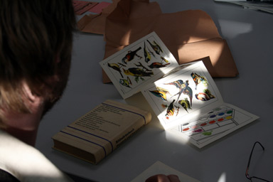
Title: Bildwörterbuch Deutsch-Französisch (Ilustrated Dictionary German-French)
Year: 1977
Quality: hardcover, number of pages 522
I like... : I like that it looks a little old-fashioned.
I dislike... : –
- - - - - - - - - - - - - - - - - - - - - - - - - - - - - - - - - - - - - - - - - - - - - - - - - - - - - - - - - - - - - - - - - - - - - - - - - - - - - - - - - - - - - - - - - - - - - - - - - - - - - - - - - - - - - - -
Eleonore
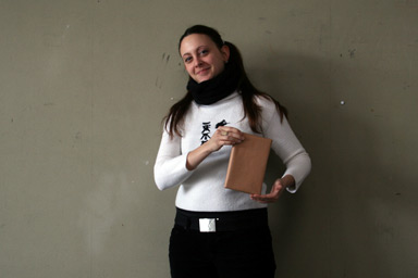
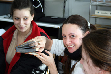
Title: Der Kampf ums Matterhorn (The Battle Around the Matterhorn)
Year: 1929
Quality: hardcover, number of pages 274
I like... : I like the colors. Orange and blue. Even on the side of the page.
I dislike... : I think I just like it
- - - - - - - - - - - - - - - - - - - - - - - - - - - - - - - - - - - - - - - - - - - - - - - - - - - - - - - - - - - - - - - - - - - - - - - - - - - - - - - - - - - - - - - - - - - - - - - - - - - - - - - - - - - - - - -
Géraldine
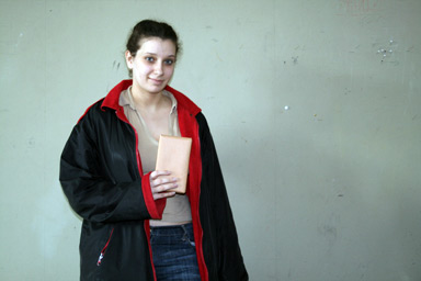
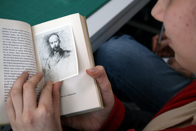
Title: Jahrbuch zur Pflege der Künste (Yearbook in Support of the Art)
Year: 1957
Quality: hardcover, number of pages 225
I like... : The cover is nice. It has no type on it. Maybe it had a dust jacket around it.
I dislike... : Some of the images are not really printed inside of the book, but only sticked into it. So they can easily be pulled out.
- - - - - - - - - - - - - - - - - - - - - - - - - - - - - - - - - - - - - - - - - - - - - - - - - - - - - - - - - - - - - - - - - - - - - - - - - - - - - - - - - - - - - - - - - - - - - - - - - - - - - - - - - - - - - - -
Géraldine
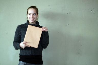
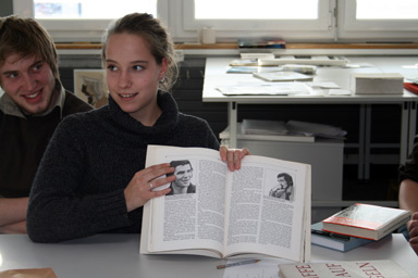
Title: Burt Reynolds – Portrait of a Superstar
Year: 1979
Quality: paperback, number of pages 109
I like... : Some of the images are placed against the grid in a funny way.
I dislike... : On the cover he has spinach in his teeth.
- - - - - - - - - - - - - - - - - - - - - - - - - - - - - - - - - - - - - - - - - - - - - - - - - - - - - - - - - - - - - - - - - - - - - - - - - - - - - - - - - - - - - - - - - - - - - - - - - - - - - - - - - - - - - - -
Julien
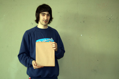
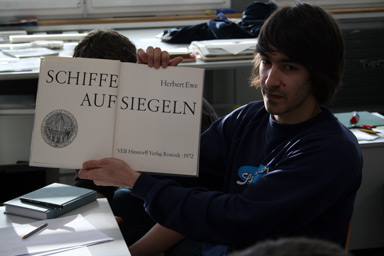
Title: Schiffe auf Siegeln (Boats on Seals)
Year: 1972
Quality: hardcover, number of pages 230
I like... : It is about a rather old form of coporate identity.
I dislike... : The layout on the first double page is bad. But the rest of the layout is good.
- - - - - - - - - - - - - - - - - - - - - - - - - - - - - - - - - - - - - - - - - - - - - - - - - - - - - - - - - - - - - - - - - - - - - - - - - - - - - - - - - - - - - - - - - - - - - - - - - - - - - - - - - - - - - - -
Ludovic
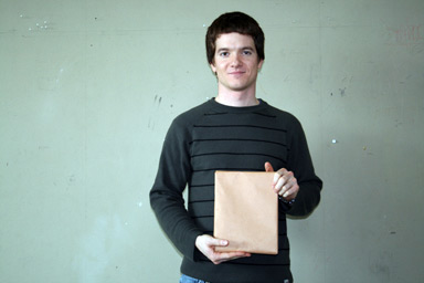
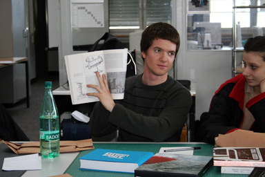
Title: Der Wandel des Weltbildes. (The Change in the Worldview)
Year: 1983
Quality: paperback, number of pages 313
I like... : The different style of maps are interesting
I dislike... : As a book it is not very attractive
- - - - - - - - - - - - - - - - - - - - - - - - - - - - - - - - - - - - - - - - - - - - - - - - - - - - - - - - - - - - - - - - - - - - - - - - - - - - - - - - - - - - - - - - - - - - - - - - - - - - - - - - - - - - - - -
Matthias
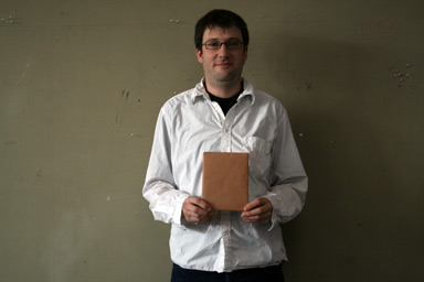
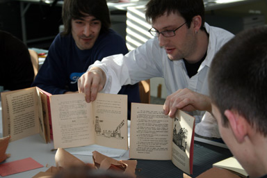
Title: Enfantines (3 issues)
Year: 1930 / 1931 / 1938
Quality: softcover, number of pages 16 each
I like... : I like the illustrations. They are made by children. They have something
"tribal" – a little African touch.
I dislike... : It is done in a very cheap way. There are a lot of mistakes.
- - - - - - - - - - - - - - - - - - - - - - - - - - - - - - - - - - - - - - - - - - - - - - - - - - - - - - - - - - - - - - - - - - - - - - - - - - - - - - - - - - - - - - - - - - - - - - - - - - - - - - - - - - - - - - -
Thibaud
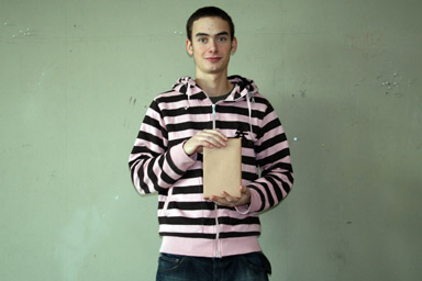
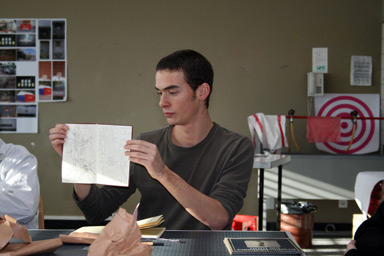
Title: Halle – Saale
Year: 1960
Quality: softcover, number of pages 180
I like... : There are beautiful maps in the front and in the back.
I dislike... : It lacks a bit of rhythm. There is just one font – a beautiful one – but just one for all the text and the notes, etc.
- - - - - - - - - - - - - - - - - - - - - - - - - - - - - - - - - - - - - - - - - - - - - - - - - - - - - - - - - - - - - - - - - - - - - - - - - - - - - - - - - - - - - - - - - - - - - - - - - - - - - - - - - - - - - - -
Valentine
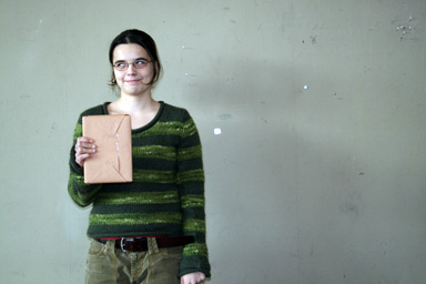
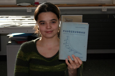
Title: Flugzeugbau (Aircraft Construction)
Year: 1962
Quality: hardcover, number of pages 226
I like... : The layout is interesting, with many text, number, drawings and tables.
I dislike... : It is very technical. At first it looks like an average reading book, but then the content is very much about technical information.
- - - - - - - - - - - - - - - - - - - - - - - - - - - - - - - - - - - - - - - - - - - - - - - - - - - - - - - - - - - - - - - - - - - - - - - - - - - - - - - - - - - - - - - - - - - - - - - - - - - - - - - - - - - - - - -
Waleska
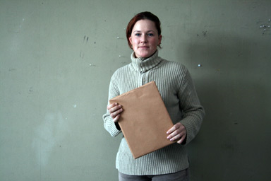
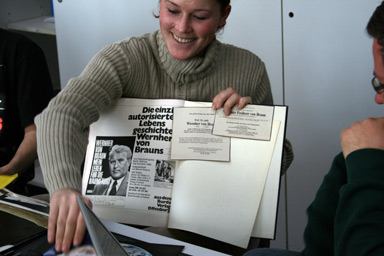
Title: Der Flug zum Mond (The Flight to the Moon)
Year: (cant find)
Quality: hardcover, number of pages 127
I like... : Nice type design on the chapter intro pages. A lot of aditional material in it by the former owner, like clippings for newspapers and magazines.
I dislike... : The rest of the text is too large and therefor difficult to read to massive.
- - - - - - - - - - - - - - - - - - - - - - - - - - - - - - - - - - - - - - - - - - - - - - - - - - - - - - - - - - - - - - - - - - - - - - - - - - - - - - - - - - - - - - - - - - - - - - - - - - - - - - - - - - - - - - -
Yassin
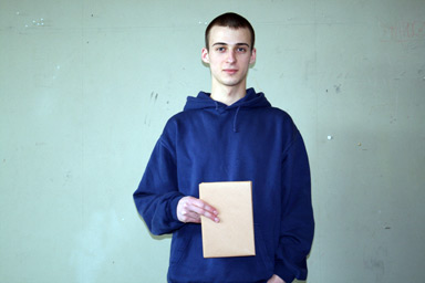
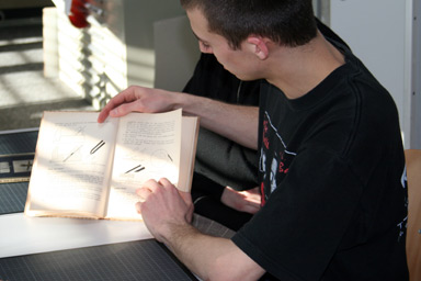
Title: Kleine Holzfachkunde für Berufsschulen (Small qualification on wood for training schools)
Year: 1949
Quality: hardcover, number of pages 112
I like... : I like the mix of pictures and illustrations.
I dislike... : I don't like the type (futura) for the long text. And there is only the one font for all the book, so there is little rhythm.
-----------------------------------------------------------------------------------------------------------------------------------------------------------------------------------------------------------------------------
< back to top